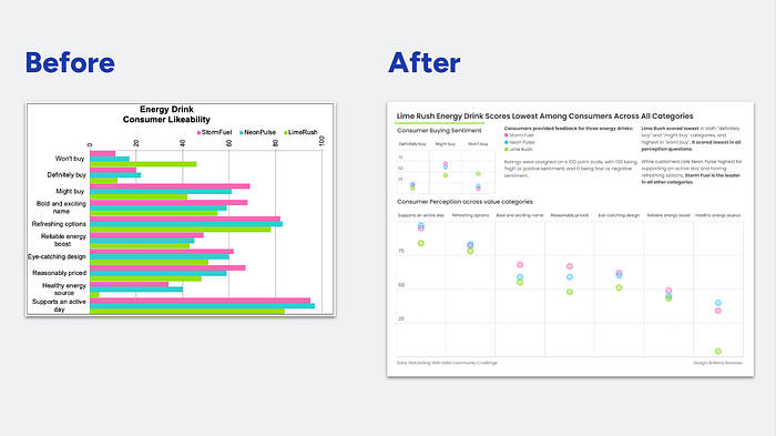
Storytelling with Data Community Exercise — Use Space and Alignment Effectively.
In this post, I’ll walk through my solution to the following exercise, making over a bold neon bar chart.
You can find the original Storytelling with Data prompt here: https://community.storytellingwithdata.com/exercises/use-space-and-alignment-effectively

Original Visual and Prompts:
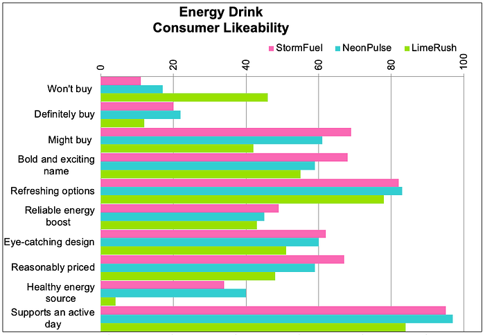
STEP 1: Reflect on what specific changes you would recommend when it comes to applying consistent use of alignment and effective use of white space. List them out.
My thoughts:
- Alignment: I find the labels on the left hard to read, since they’re sort of centered but not justified to anything. The title feels off center, and I find the legend placement awkward. I also find the rotated numbers odd/hard to read.
- White Space: because there is no white space between the categories (won’t buy, definitely buy, etc) and the colors are very bright, I find it hard to compare the different brands across the different categories. I can’t quickly tell you which brand is doing better or worse than another. I would add at least some white space in between the bars, and perhaps just more white space in general so the overall effect isn’t so loud.
STEP 2: What additional steps might you consider to further declutter or otherwise improve this visual? Take a note of these in preparation for the next step.
My thoughts:
- I’m not sure what I want the final to look like, but I do think I will try to get rid of or at least lighten the gridlines. Sometimes I think gridlines are okay as a benchmark, but right now they’re capturing a lot of visual attention that I don’t personally find is helping me understand the data.
- I don’t hate the bright colors! But I do think they could be used more effectively.
STEP 3: Download the data and make the changes you’ve identified in the previous steps to transform this bar chart. Look back at the original and note the impact your changes have made.
Building my Makeover in Tableau
- I’ve kept the neon colors for this makeover, but wanted to check against accessibility and see if it should get any tweaks. I pulled up my new favorite tool, color buddy, and added in the colors.

The originals passed the color blind accessibility checks, but I chose to adjust them slightly to adjust for the “does not have ugly colors” test, as well as “even distrubution in hue”. The resulting colors look nearly identical as the input ones, but work a little better for data viz, which achieves my first goal.
2. I do a simple copy/paste of the data into Tableau, and then in the data source I pivoted the energy drinks, because I knew I wanted to use “brand” as my field on color.

3. There are 10 response categories, which can be a lot to scan. I decided to split them up into two different groups — one based on whether the customer will choose to purchase the drink, and the others based on their perception of things like cost, flavor, etc.

4. I think a dot plot will show this data well- to get a stylized look I’ll use a dual axis chart, using a filled circle with reduced opacity, and a unfilled circle at the full color saturation. This lets me keep my bold colors, while providing a softer, stylized look.
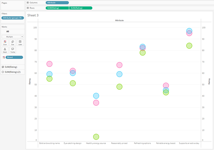
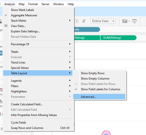
5. I don’t like the labels at the bottom of the chart — I’d rather they be on top. To fix this, I’ll go to Analysis > Table Layout > Advanced. In the pop-up window, I then uncheck “Show innermost level at bottom of view when there is a vertical axis”.

6. Now that my labels are on top, I want to sort the results to better see if there are any patterns. I’ll sort by the rating descending, which shows me that Lime Rush is lowest across the board, and there is some competition between the others.
You’ll also notice I’ve decided to keep the gridlines — while I think they’re most often unneccessary, I do think the viz looks too sparse without any anchor points to reference. So in this case, I’ve turned the gridlines to a light gray instead of black. I’ve kept the lines on in between columns to easily read from the label downward. I’ve also split the horizontal gridlines at just the 25, 50, and 75 mark. You can get the full value of the mark when you hover, but I like having the quartile marks as ‘anchor points’ for glancing and making a judgement on the scores.

8. Putting it all together- I’ve decided to put it in a simple ‘dashboard’ — two charts with some commentary.

Closing thoughts
I enjoyed this challenge — and it’s my first submitted to the Storytelling With Data Community. I appreciated the structured approach they gave to this challenge, I like doing makeovers with clear goals. In this case, I think my viz may have swung over into ‘too much’ white space, but overall I’m pleased with the result and find it easier to interpret than the original.
I’d highly recommend giving the original challenge a try — one thing I appreciated about the Storytelling With Data Community Solutions is you can’t see what others have done before you submit yours! After submitting, it’s interesting clicking through and seeing how others interpret the challenge.
If you’d like to crack it open to see how it works, or just bookmark for future reference, you can find my solution on Tableau Public here: https://public.tableau.com/app/profile/brrosenau/viz/StorytellingWithDataEnergyDrinkMakeover/StorytellingWithDataEnergyDrinksMakeover
