Makeover Monday 2024 Week 30 — Streaming Hits 40% of U.S. TV Usage
Makeover Monday is a weekly project where participants improve how they visualize and analyze data — one chart at a time.
Here’s my thought process working through this week’s challenge.
The original chart(s)
Chart 1:

Chart 2:

Initial thoughts:
Overall: Not bad charts, but this is Makeover Monday — the goal is to improve them, and I know I can.
- Chart 1: Honestly, not the worst pie/donut chart! There are 4 categories which isn’t too many slices, and Streaming, the most important slice starts at 12 o’clock on the pie. I do think it’s tough to see streaming is the most important when all colors are neon.
- Chart 2: Again with the neon — it’s not a bad color palette, but as a former coworker once said: “three people screaming at once is not communication” — 4 neon colors at once is not going to be the most effective choice here. Since streaming isn’t at the bottom of the stacked bar, it’s hard to see compare growth over time to the other categories.
Making over the charts in Tableau
First up: the pie/breakout combo.
I don’t think the donut is bad, but there’s nothing in the middle, so I’m going to make it a pie instead. Also, I’m going to order them so that the slices go from largest to smallest, clockwise.

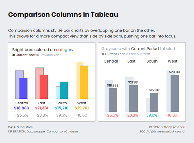
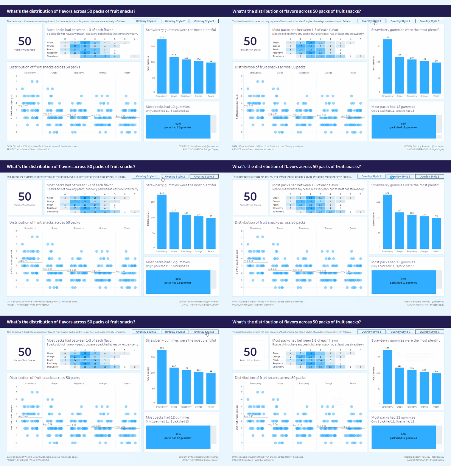
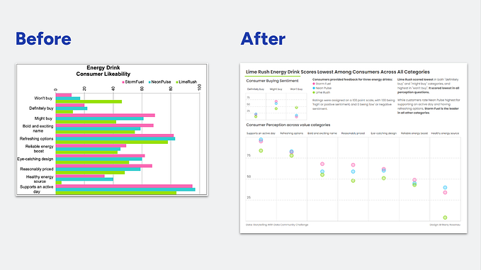
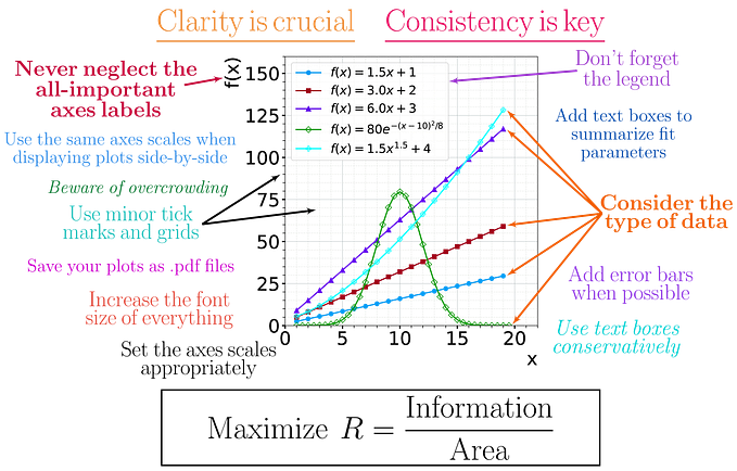
I think the original colors of the viz were fun, but too much together. So I’ll keep the bright purple for streaming because that’s what I want to focus on, and have the others in shades of gray. I’ll also make the border of the slices white so that the slices are a little more distinct.

Now to makeover the breakout:

I don’t think the logos are necessarily bad — I can quickly make a fast association to the brand name.
But I’d rather be able to visualize how much of a share each streaming service has.

To spice up the bar chart, I’ll use a dual axis chart — with one axis being the bars, and another a gantt bar. This lets me color the gantt bar the same bright purple as before, but keep the bars at a lighter tint. I’ll label the regular bars with the streaming service, and the gantt bars with the percentage. I’ll use a manual sort to drag the “other” category to the bottom of the list.

Now on to the last chart — the trended view!

First I’ll recreate the stacked bar with my vizzes’ colors. While it’s not bad, I don’t like that it’s hard to compare the categories against each other, especially broadcast and cable.

Splitting it out into a line chart, it’s easier to see how the categories are trending. But because the lines are so far apart from each other, aesthetically it looks pretty sparse.

I’ll use the dual axis trick again to make a combination area + line chart, and split each category out seperately. That way I can view the trend for each, and also compare them against each other. It will fill up the space at the bottom of my dashboard nicely. Note — in this case, I’m fixing the axis so because I want to compare each category to each other.

With some formatting, the final dashboard looks like this:

Do you think it’s more effective than the original charts? Try your hand at this or other challenges by heading to https://makeovermonday.co.uk/


