Let end users change the color palette in Tableau with a parameter
You may find yourself in a situation where a stakeholder would like to see information colored in different ways. Rather than creating multiple charts, one way to do this is let them select different categorical colors by using a parameter.
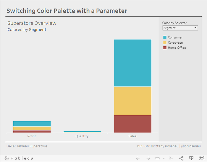
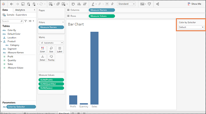
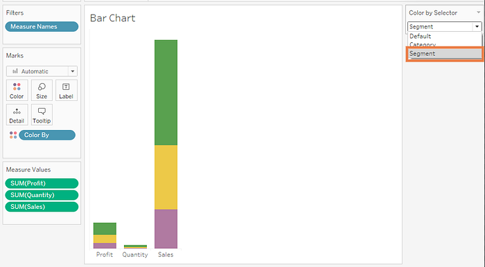
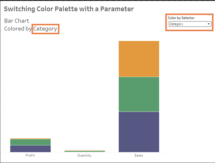
In this example, we will use a bar graph showing total Profit, Quantity, and Sales from the Superstore dataset.
Step 1: Create Parameter
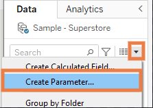
Create a parameter by using the dropdown near the top of the Data pane, or right clicking in the data pane and clicking “Create Parameter”.
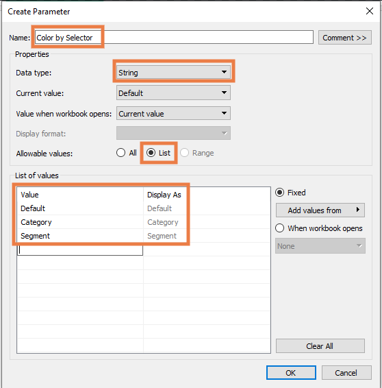
In the dialogue box that opens,
- Give your parameter a name
- Select Data Type: String
- Select Allowable Values: List
- Type in the fields you want to color by in the list of values.
- Click “OK”
Note: In this case, ‘Default’ is not a field but will be one of the options we use to color by later.
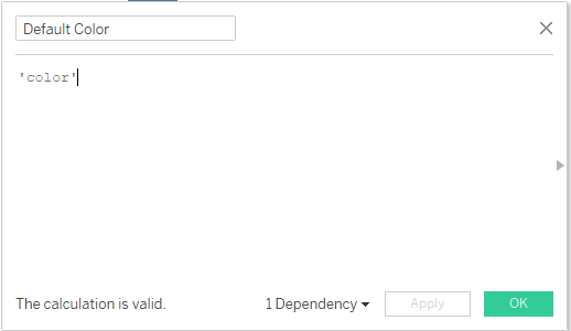
Step 2: Create a calculated field to use for the Default setting.
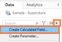
This step is optional, but since I am using it in the example we’re going to create it! Create a calculated field by clicking on the down arrow near the top of the data pane, or right clicking in the data pane and selecting Create Calculated Field.
In this case, I just want the default color to be solid based, so I enter the string ‘color’. Click OK.
Step 3: Create a Calculated field to color by
Use a CASE statement to determine what fields to color by. After WHEN you should list the string values that you typed in the parameter we created in step 1. After the THEN, enter the field that you want to color by when the user selects the option. You can see in this case, when the user selects ‘Default’, the field we created in step 2 is used. Click OK.

Step 4. Show the parameter on the view
Right click the parameter created in step 1, and click Show Parameter.

You’ll notice that the Color By Selector now shows up on the right.
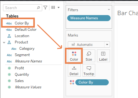
Step 5. Set your Colors
Drag your ‘Color By’ calculated field onto Color on the Marks shelf
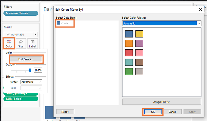
Time to change the default color!
- Click Color
- Click Edit Colors
- Choose what color you’d like for ‘color’ (or whatever string you entered for your calculated field in step 2)
- Click OK
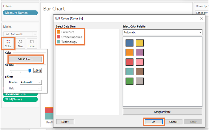
Now, in your Color by Selector, select Category instead of Default. You’ll notice the bars are now colored by category.

If you’d like to change the automatic colors applied, repeat the process of clicking Color > Edit Colors, choosing your colors, and clicking OK.
Repeat the process one last time by selecting Segment, and choosing your colors.
Step 6: Creating your dashboard
On your dashboard, you now need to make sure your parameter is visible for your end users.
- Select your sheet on the dashboard
- Click the little down carrot (▼)
- Click Parameters
- Click Color by Selector
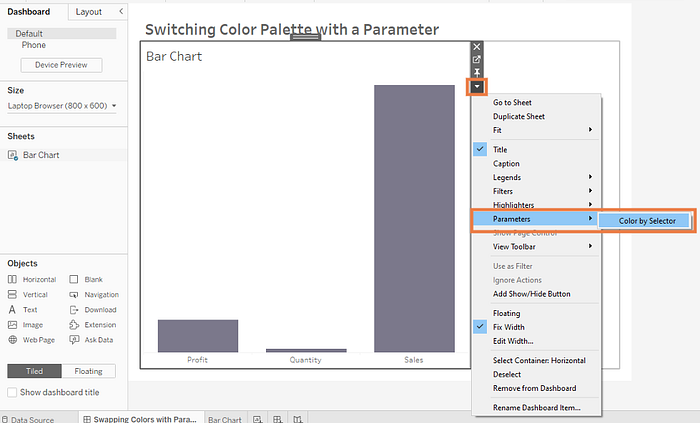
That’s it! Now your users can select how they’d like your chart to be colored.
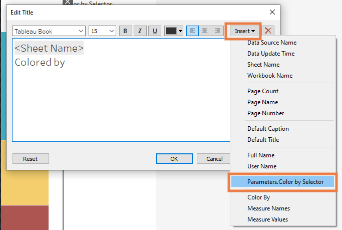
Bonus Step
You can make the user’s selection visible in your chart title as well. When editing the title, insert the parameter as shown below:
Your title will look something like this:
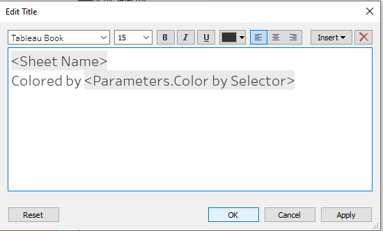
Now, when your user selects what to color by, it will appear in the title. This can be handy if your selector is not near the chart, or is hidden in a show/hide container.
I hope this was helpful! Note — colors and chart used in this example is for illustrative purposes. Please make sure to follow best practices when chart choosing as well as picking colors.
You can check out the interactive dashboard, and download for yourself to reverse engineer here: Tableau Public Link
Happy vizzing!